The commision
A modern, elegant & clean design that matches the brand’s DNA
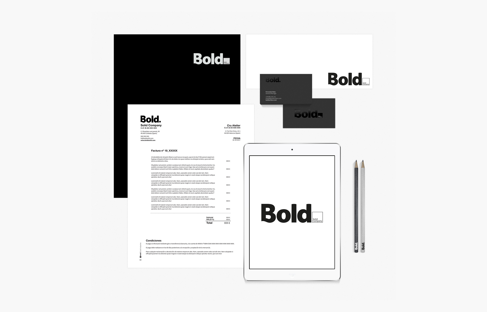
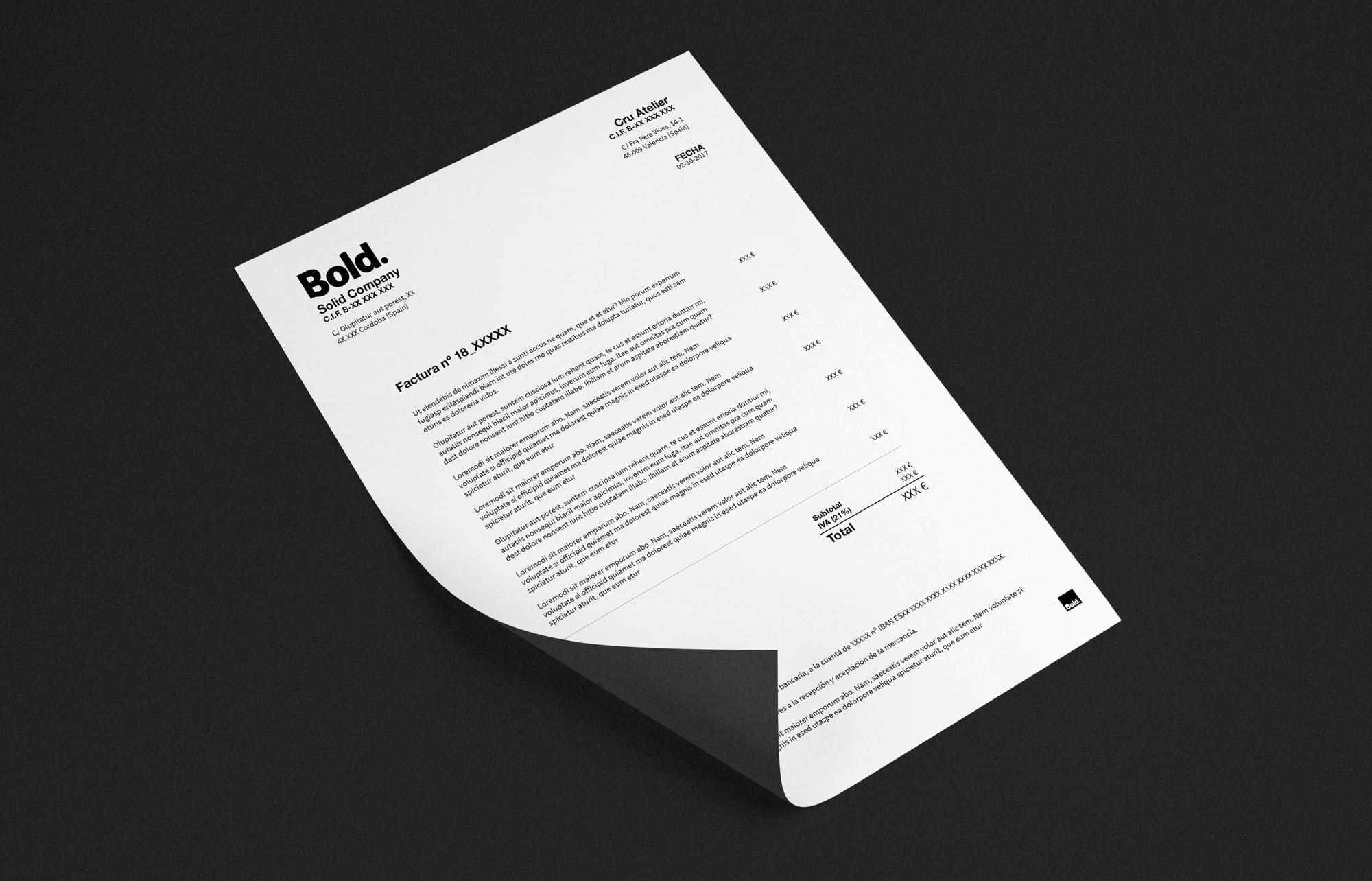
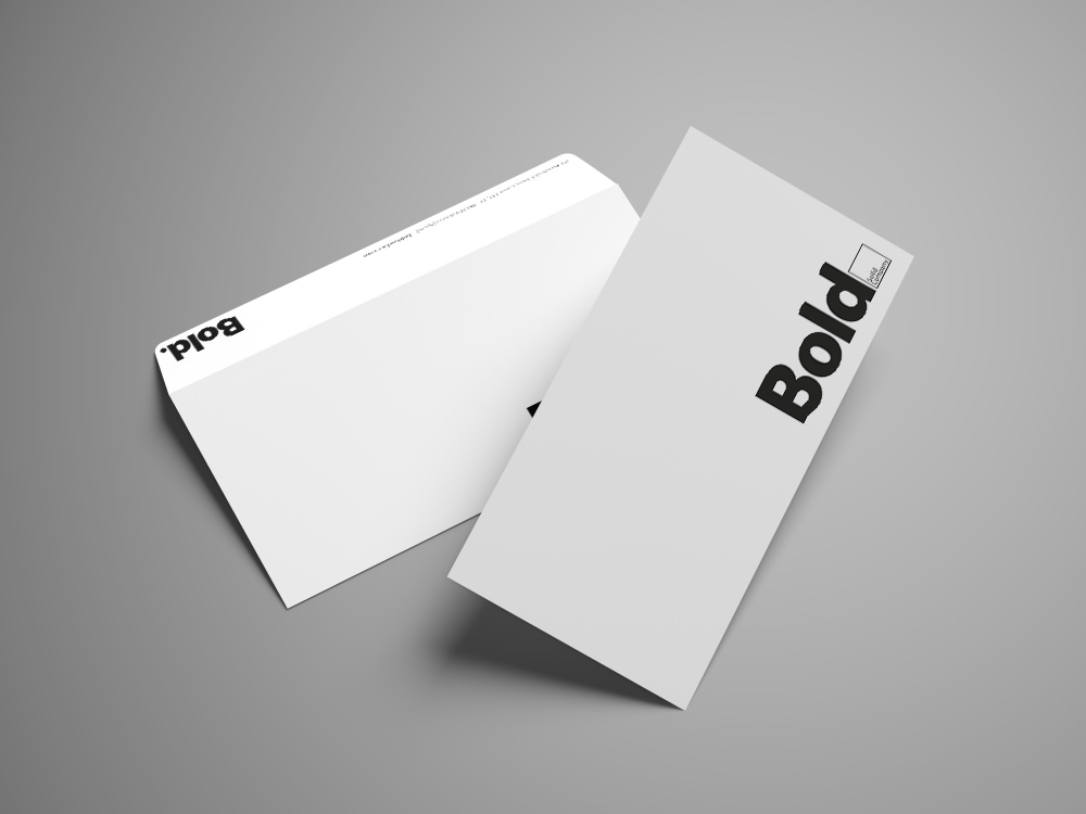
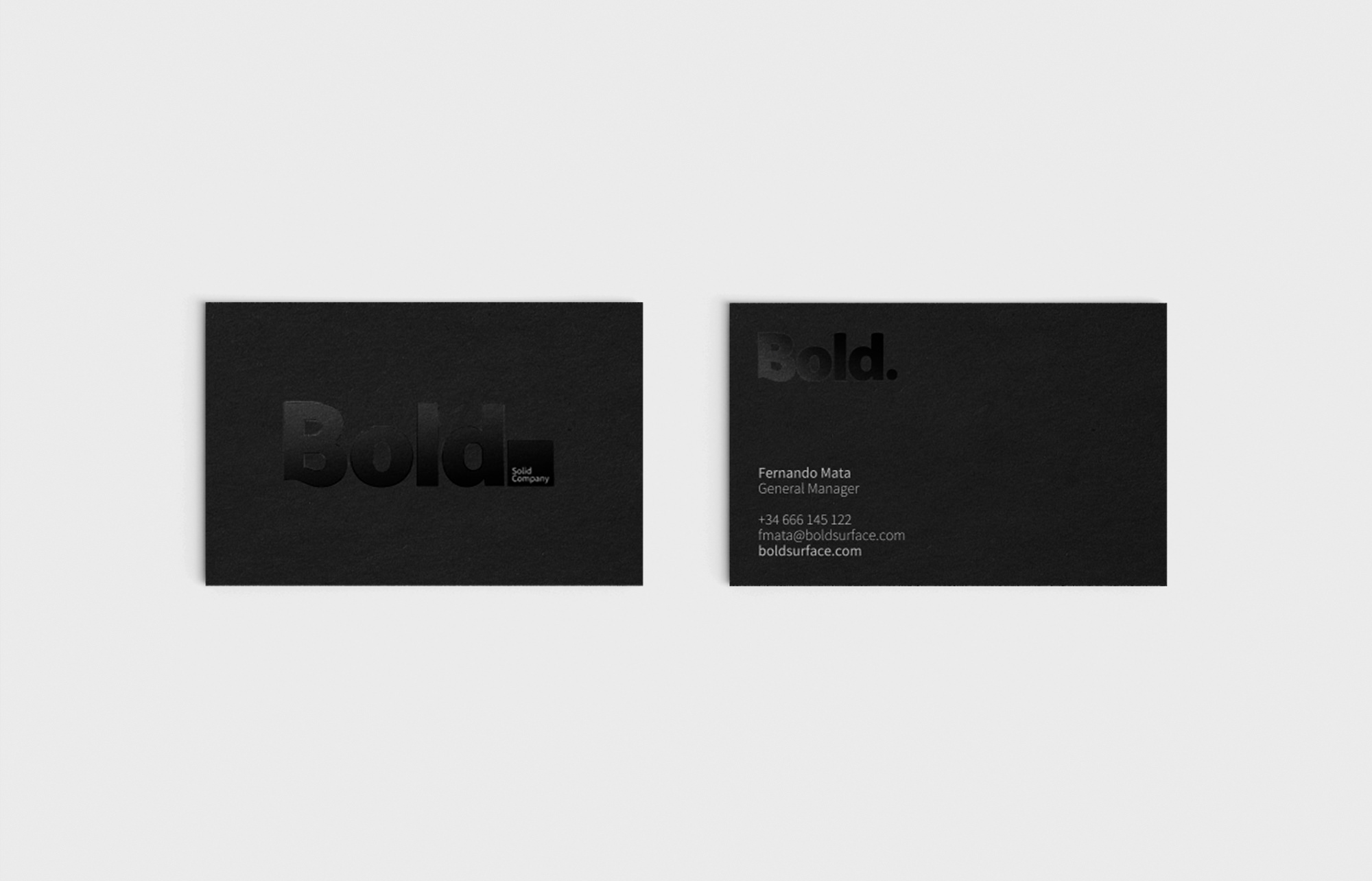
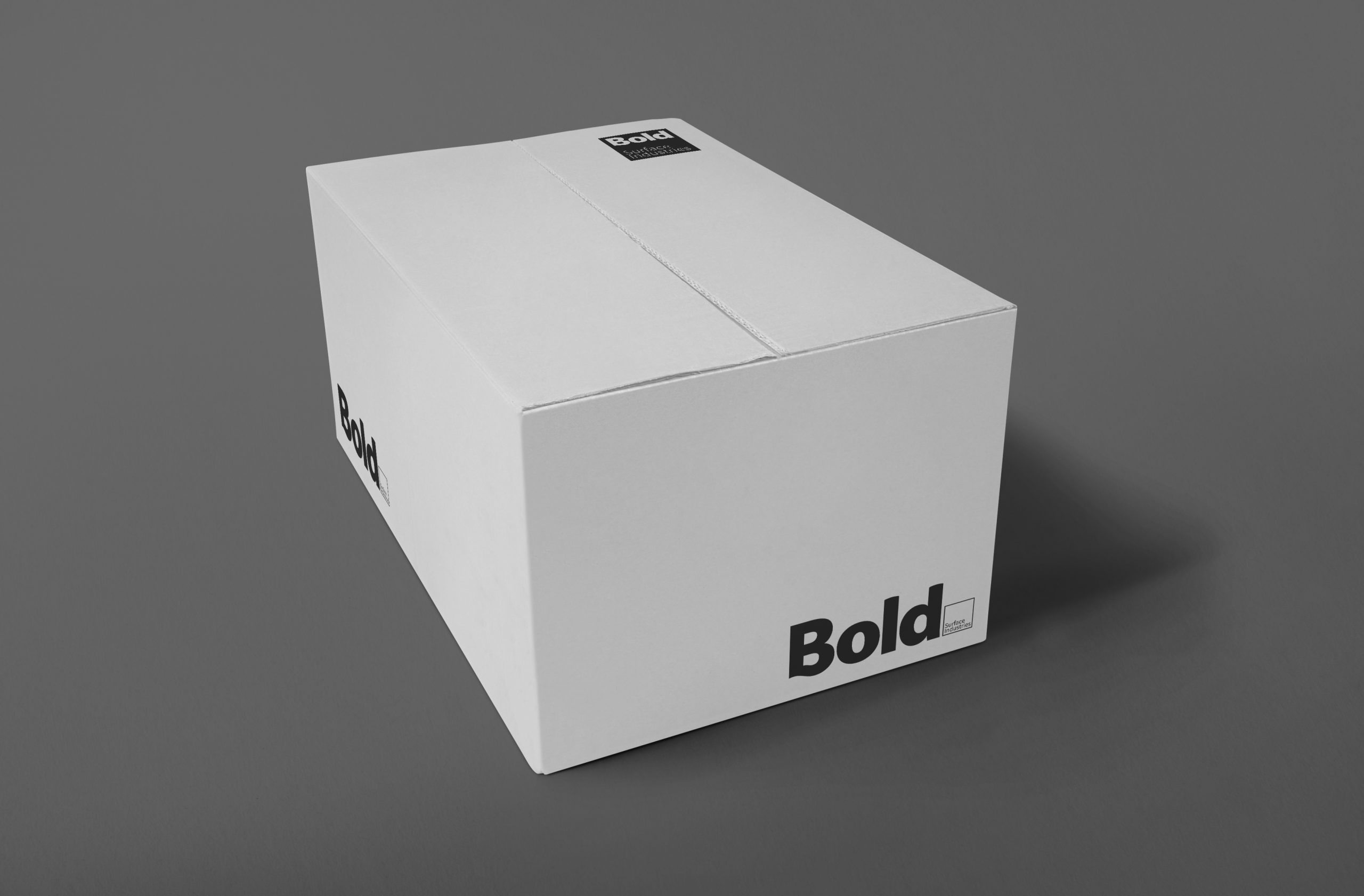
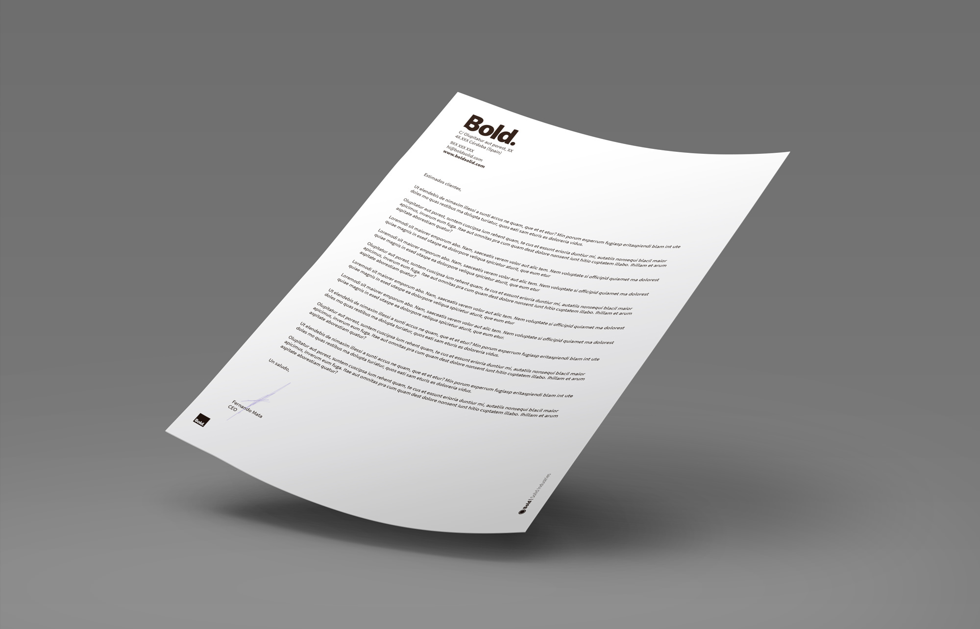
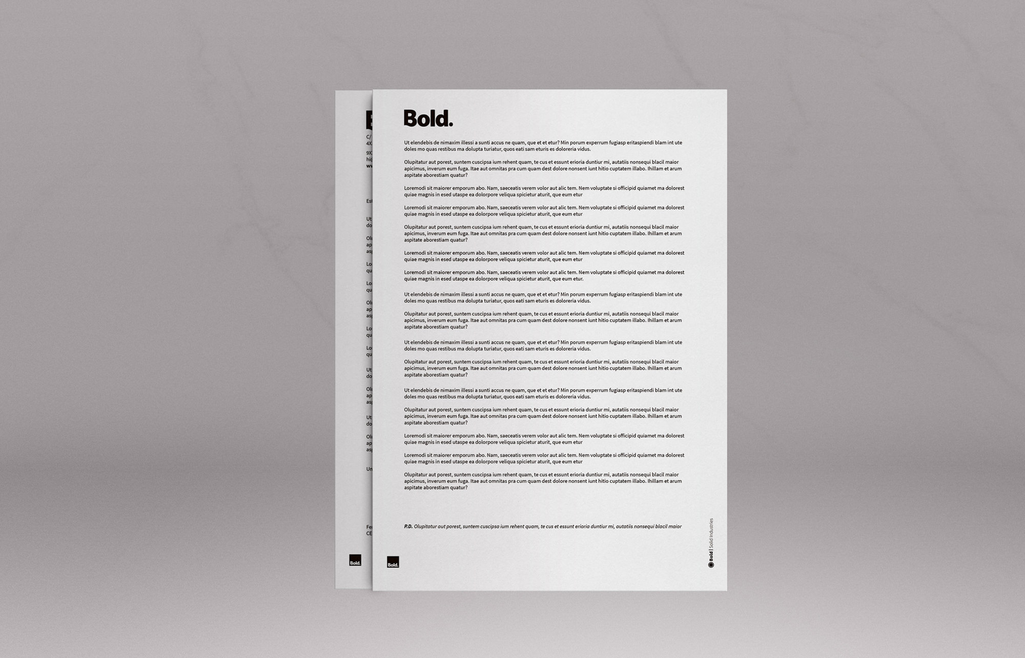
A long-term client approached us for creating the whole branding for its new Solid Surface company, including the naming, logotype, communication system as well as its whole applications.
Client
Bold. The Solid Company
Agency
Cru Atelier
Project
Branding, Web Design
Year
2018
Our Goal
Make a timeless design, sober & versatile
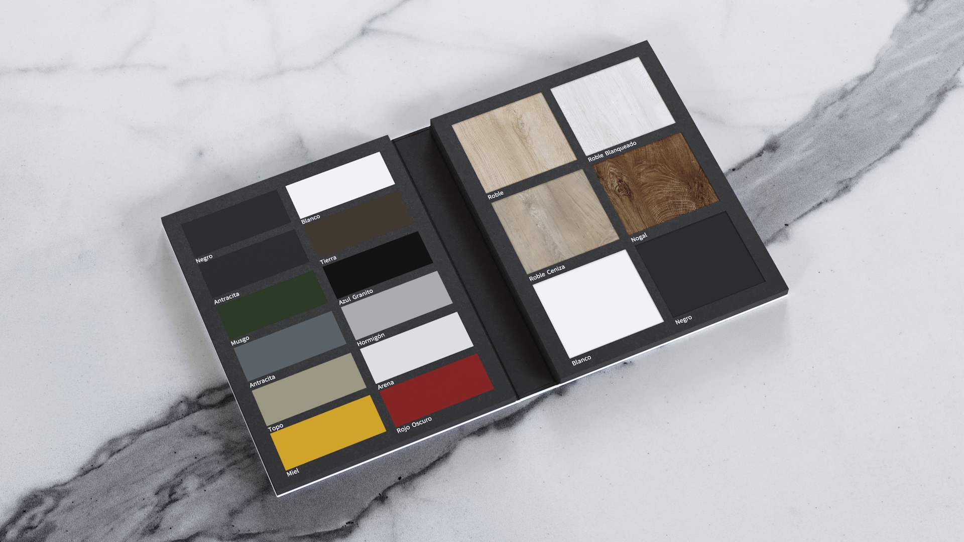
The company’s main occupy is to make high quality solid surface countertops, washbasins as well as bathtubs & shower trays. During our first meetings, the main idea was to relate the word «solid» with the company values, being these manufacturing the highest quality products, with a compromise with their clients and environment that leads to a better and more sustainable future.
That explained, we interiorized and developed the concept «solid» a bit further, making a paralelism between the word «solid» and «bold» as a concept; a word that means full (of energy, new ideas and commitment), but also remarkable, something that stands out from the crowd by following its own path that leads the company to think and act different.
So Bold became our choice at an early stage, being rapidly adopted by everyone involved even before the first sketches were done.
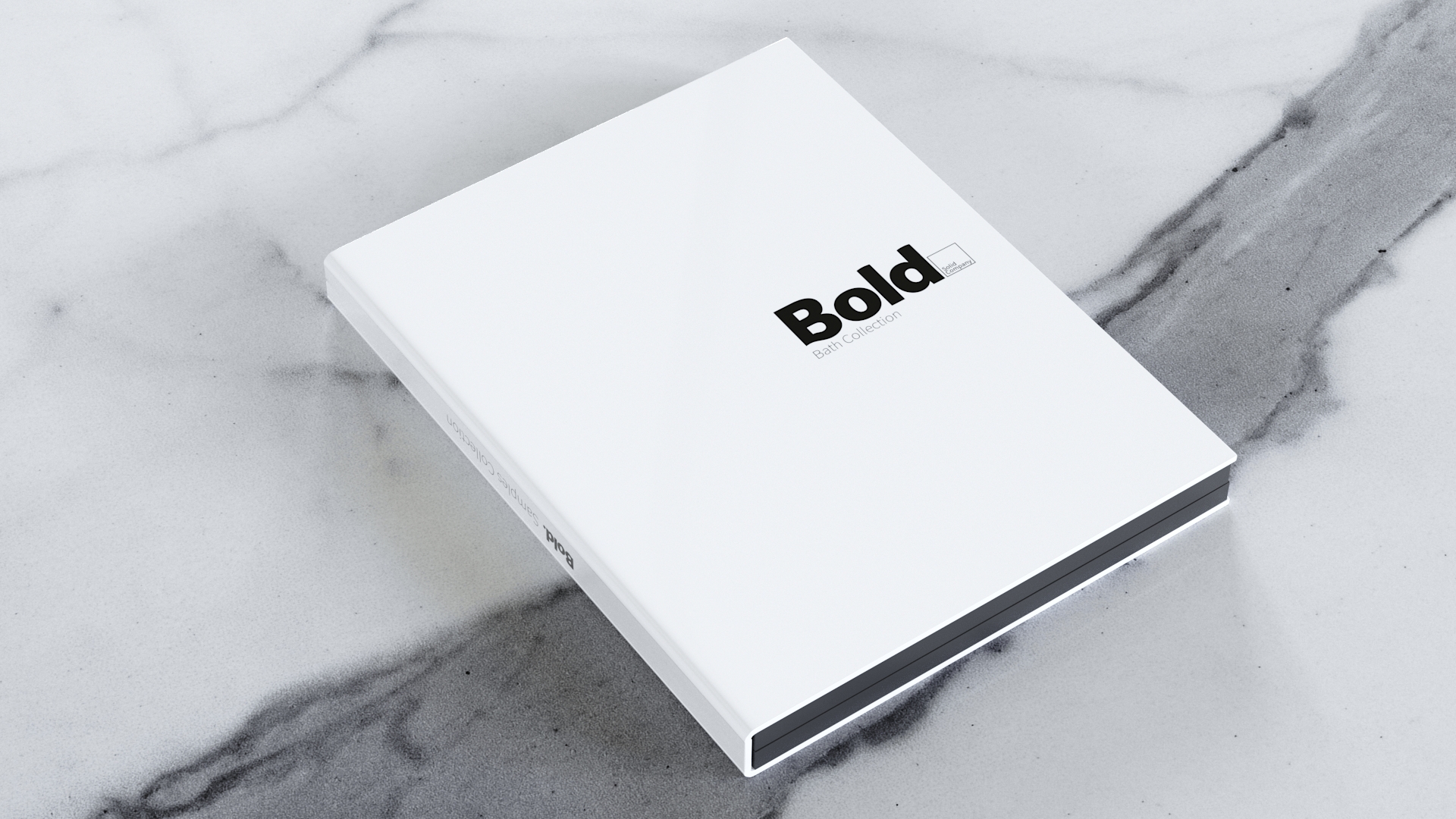
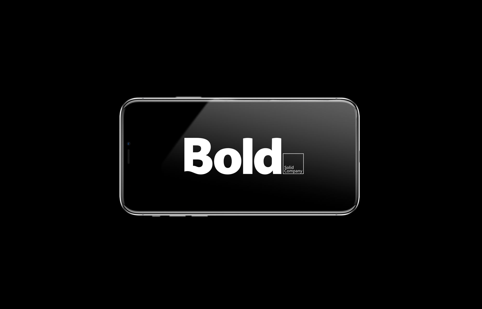
Finally, the logo concept evolved from the naming, and the values were reinforced by the use of «The Solid Company» caption. Obiously, a bold typography was a must, so the «solid» concept underlying was firmed up and a subtle curve that makes reminiscences to water wave was introduced at the capital «B».
Two tone design
The brand at its best
Lorem ipsum dolor sit amet, consectetuer adipiscing elit, sed diam nonummy nibh euismod tincidunt ut laoreet dolore magna aliquam erat volutpat. Ut wisi enim ad minim veniam, quis nostrud exerci tation ullamcorper suscipit lobortis
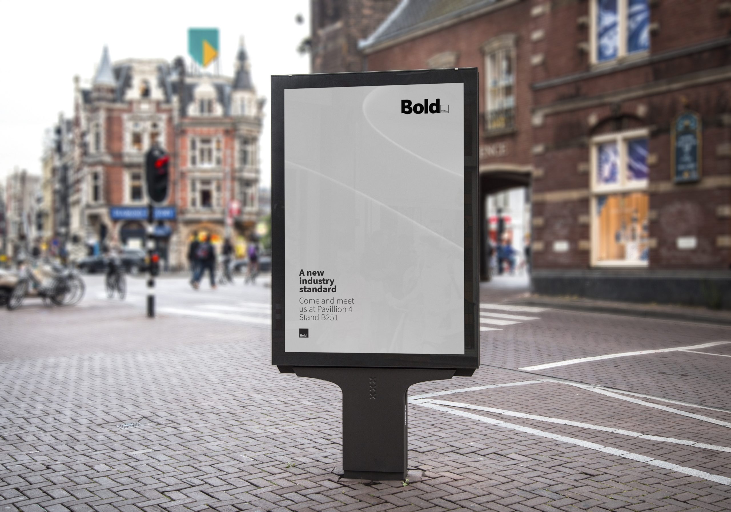
Bold. The Solid Company aims to be more than a manufacturer, being its leitmotiv design and innovation made for the people while taking care of the environment. All of their collections are designed with human interaction and aesthetics in mind. That led us to develope a branding project made to reinforce every brand aspect.
